First of all I want to say the UI is generally great, you can see there was lots of effort put into it from both the UI designer’s and the developers’ side (also I love your logo lol). But still, I want to share a few issues and inconsistencies I’ve noticed with the Windows desktop app since I started using it recently
Windows 10 22H2 (build 19045.2311)
Desktop app v2.70
-
General features
-
I wish there was an option to display an Icedrive icon in the corner of the synced folders, similarly to Mega or Google Drive. Imho it’s a nice reminder to the user which folders are synced (plus I’d live to see the smexy blue bear icon everywhere lmao)
-
I wish we had an option in the right click context menu (on the Windows client side) to create a share link to a file/folder when its being clicked on inside a synced folder. This is something that Mega has and it works really well, it generates a public link instantly without having to open the program fullscreen or enter the web UI. Or it could be a function that brings up a similar window as the web UI does when creating a link, with various options and settings, rather than a straight up link creation
-
I’m not sure about the software/programming side of it, but I really wish there was a continuous sync option rather than an interval, so every single change would be immediately updated on the other side of the sync pair
-
-
Account page
-
Space usage meter under the account email doesn’t reflect actual space usage. It seems to update only at the startup of the program
-
Since Icedrive has a very consistent appearance, it’s strange to have a random gold button for “Upgrade”. Imho it should be the regular blue or blue-cyan gradient
-
I think it would be nice if the monthly/annual billing dates were shown here so they user always knows when to expect the next payment
-
-
Sync page
-
The created sync pair doesn’t reflect the actual folder name that’s on the cloud. If I initially create the sync pair and then rename the folder on the cloud the sync is still going on uninterrupted (good) but the folder name in these sync pairs will not update to the actual folder name on the cloud side. It says whatever the cloud target folder was named at the time when the pair was set up
-
The “Pause”, “Stop sync” and “View log” buttons are really out of place and don’t follow the other UI elements visually. They should appear with the same font and button style as the “New sync pair” for example, rather than 3 simple text buttons with seemingly random colors that don’t appear anywhere else. Also I’d switch up the “Pause” and “View log” options, I don’t see why the “Pause” is in between them. Generally deleting (or closing a window for a better reference) has its button in the right corner which is the closest button to the corner. It should be placed there instead, and it should be the only red button, just like the “Erase all” button on the web UI in the Trash. For example you could have a red square button with an X in it to suggest it’s a delete function, and have a blue/grey square button for pause
-
The “Stop sync” should be renamed “Delete sync pair” because that’s what it does. “Stop sync” tells me that it’s a kind of pause, rather than a deletion, kind of like how media players have pause and stop functions where “pause” just pauses at the current time, but “stop” stops the playback and jumps back to the start. Now obviously that’s not something you do with sync, but just the name alone should be clearer
-
I really wish there was a detailed log for everything that is being/has been synced one by one (either for each sync pair individually or a global log). Right now it only says how many files/folders are being or have been synced since the program launched which isn’t particularly helpful imho. I’d rather have a detailed list of all the files that have been synced successfully, and ones with error etc. so I could confirm that the changes I’ve made have been in fact synced correctly. For example Mega does a good job at this, you click on the tray icon and it brings up a small window where you can see all the synced file history since the startup of the program. And I wish it also listed everything including new, moved, deleted, renamed etc. files too in a scrollable list. Optionally it could be a function instead that leads to the “Transfers” page where the detailed scrollable logs would be
-
I think on the page the current sync status should be visible. Either a percentage for the current operation, or an “Up to date” checkmark or something, next to each sync pair
-
When I add a new sync pair, the folder list on the cloud side don’t update unless I restart the program. For example if I create a folder manually on the web UI, then want to set up a sync through the desktop app and cloud’s folder list doesn’t reflect the changes. It should be up to date at all times whenever I want to add a new pair
-
When I add a new sync pair and want to create a folder on the cloud with a different name than the default (which takes the local folder name if that was selected before the cloud folder) I can’t do that in the root cloud folder. The “New folder” gives me an error saying “Please select a parent folder” which is quite strange. I can ofc create a subfolder under existing folders on the cloud, but I can’t create a new folder in the root of the cloud through this window, but I should be able to
-
-
Transfers page
-
The active transfers’ progress bar sometimes goes off-window which I’ve only seen once but couldn’t replicate it again. I was switching between various window sizes including Windows’ own window arrangement system, and noticed that the progress bars were not as wide as the Icedrive app window, but they were the width of the entire screen which I could see when I made the app full screen, then the progress bars were displayed correctly. But when I switched back to a smaller window size the right side of the green progress bars didn’t end at the margin of the program’s window as they should have, but were reaching all the way to the outer edge of the window. They were still contained within the boundaries of the window tho. I was able to catch it for a screenshot. I’m uploading about 2k small files and each time an upload is completed the progress bars seem to randomly go beyond their intended width. To me it seems like it might be because of the long filename, which pushes the speed and “Cancel” buttons to the right oo much?
Also the “Overall speed” sometimes goes nuts and displays a way higher number than reality. Currently my ISP’s max. upload speed is 300 Mb/s (37,5 MB/s), so that 156 is quite unrealistic, but I’ve seen 300+ too
 Tho I must mention that I like the remaining files and data info
-
-
Settings page
-
The checkbox items should be more visible. This is something that Windows 11 started doing really well, where the entire checkbox turns into blue (or theme color I guess?) which makes them instantly more recognisable as “checked” compared to the thin checkmark that exists currently. Something like this, the top is the current, the bottom is my suggestion:

-
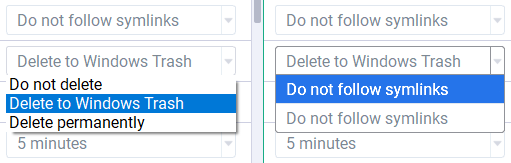
The drop-down menus don’t seem to appear correctly. They’re missing their light grey borders, the menu corners are squared instead of rounded and the strong shadow doesn’t look very appealing either. This might be a Windows limitation tho? I did a visual comparison, my version is on the right. Removed the shadow, copied the button appearance to the drop-down menu and made the borders darker to show it’s being selected and to stand out from other clickable elements:
-
When I change the sync interval it seems to update at the next cycle from the previous setting. For example, if I have it set to 5 minutes, let’s assume the 5 minute starts counting down now. Then before the 5 minute mark ends I change the interval to something else (let’s say 1 minute) then this will only take effect once the 5 minute mark has finished its cycle, even tho I changed the setting to 1 minute, way before the 5 minute mark expires. This becomes a potential problem when I have it set to 24 hours, but then later decide to have it at 1 hour instead. Then as long as the program is running, it will not update the synced folders until the 24 hours countdown finishes from the previous sync time. The only way to force the interval change is to restart the app, then the new setting takes effect immediately
-
